While wondering around on the internet I stumbled across the artist who created the typography for the movie The Great Gatsby. Check it: The Great Gatsby
I so greatly enjoy when artist show some of the process(sketches) they go through to find the end result. The film and book The Great Gatsby takes place in the time of the 1920s which also is during great art period of Art Deco(one of my favorite art styles that exist).
Art Deco is know for it's geometrical shapes, definite lines, bold (but not loud like the Pop Art) colors, and splendid ornamentation. It's first appearance was in France after World War I but died out after World War II. Art Deco is the combination of traditional motifs with Machine Age imagery due to a time period of rapid industrialization. Despite the short life span of Art Deco it held great impact and shows up now and then like in the insides of the Rockefeller Center and Chrysler Buildingin New York City.
I think it's an awesome style and the artist captures the Art Deco style well in their imagery for The Great Gatsby. I also love the color usage of silver and gold which captures a unique aspect of the The Great Gatsby story.
Okay so I know airbnb has gone through a re-branding but I want to change things up from using the Brand New site so much.
So... I've been browsing around pintrest and found a branding project that reminded me of what branding is... (to me at least) Branding is a statement of who the company, object, product, thing, ect is. It's like a cover letter in visual format giving a brief description to the audience of who and what your product is (and I'm using the work product in a broad since)
Logo and branding don't have too take the exact look the product, person, or company. It's a representation. So taking elements of the product, person, or company and using them for the design rather than the product, person, or company as a whole.
The site Brand New just put up that Monster has undergone new branding! Monster is a site that you can find postings of many different jobs and job opportunities. It's been around since 1999. I've even used it myself a couple of times so to see a change in branding is interesting.
Above is the new logo.
Below is the old one
From a little research the first branding of monster they had an actual monster creature and symbol that went along with the letters. From this knowledge it makes a bit more scene of when the designers created the typography with the swirly "o" and the handwritten feel it possess.
I think the change in branding has some good aspects to it, like the MONSTER has a more business quality to it. The letters are all caps(uppercase) now rather than lowercase with a consistent amount of thickness all throughout each letter. It does posses some of the feel that the old logo through use of keeping the same colors maybe even with some of the sharpness the new logo seems to posses.
The interesting thing about the new logo is motion graphical (probably not the right wording but point remains that the logo is no longer static). Some may say that that age of paper is coming to an end and motion graphics, interactive elements are taking their place. However if you go to the monster website http://home.monster.com/home/ you can see they used the same typography of but with out the flag element.
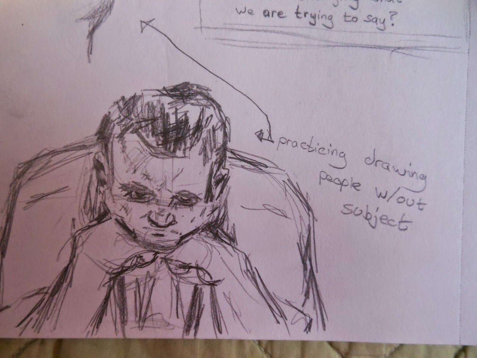
Today is just a day for sketches. I've been trying some new things out. Often it's really easy to get busy and so you can't just go out to a nice public place to sketch(like the mall or a theme park). So sketch almost anything and everything (even if they sketch looks bad). Someone once told me that it takes about 1,000 bad sketches before you find that 1 good one. So keep it up.
These two people are me practicing drawing a (pretend) person with out a subject)
Most of these sketches are the result of watching Digimon lol: