Monday, October 13, 2014

Finding Inspiration


Yeah... that is where I'm at right now. Sometimes when designing, one of the hardest things to do is find inspiration(and motivation but that's another topic for another day). I have learned over time is sometimes the best inspiration is the kind that comes from yourself.

Sketch!!!

Sketching and drawing are VERY important parts of being an artist and designer. The best way to start any project is first with paper and pencil. It doesn't matter how good or bad the sketch looks only that any and all ideas you have are recorded. The more you sketch and record any idea you have the more you will have(It's kinda like a muscle. The more you used it the better you get at it) To tackle any project it's good to take one bit at a time. Break it down into pieces in to writing and sketches(now how many pieces there are and how big depends project by project basis).

Sometimes is also can help having some books about principals of Graphic Design can help. I rather like the book call:

Graphic Design Thinking Beyond Brainstorming 


It has some interesting stuff in it. Talked about well... brainstorming and some of the different ways that people and companies brainstorm.

Well I'm done for now. Good night :)

Friday, October 10, 2014

I have returned!!!!

Hi

It's been a while (okay, a REALLY LONG WHILE) since I updated this blog. I let some life things get the best of me.

I have been learning some (what I consider) hard lessons about being an artist/designer. One very important lesson: DON'T GIVE UP, cause everyone has different versions of success and job hunting can be a roller coaster ride. Second lesson: BE SOCIAL. Make lots of friends in your field. Get out there, join organizations like AIGA and/or volunteer for things you are passionate about. If your busy: make time. If your shy or socially awkward: go do the social things anyway; there will be people that understand. Friends help friends and it can help you down the road so don't burn bridges and keep in touch with the people. When you finally get a job return the favor. These are some of the things I'm only learning now and wish I had picked them up before I graduated I hope they help anyone else who's considering being an artist or designer.

So that's all for today. Will be back updating on Monday.  ^_^

Thursday, July 31, 2014

Some of the missing Sketches


A lot has been going on lately, so my posting schedule is very out of whack. Here are some of the missing sketches.


This one is a thank you card I made today:


Monday, July 28, 2014

Insert fan girl squeel..


Monday... This counts as branding.

(And it's so cool!!!)


While wondering around on the internet I stumbled across the artist who created the typography for the movie The Great Gatsby. Check it: The Great Gatsby

I so greatly enjoy when artist show some of the process(sketches) they go through to find the end result. The film and book The Great Gatsby takes place in the time of the 1920s which also is during great art period of Art Deco(one of my favorite art styles that exist).

Art Deco is know for it's geometrical shapes, definite lines, bold (but not loud like the Pop Art) colors, and splendid ornamentation. It's first appearance was in France after World War I but died out after World War II. Art Deco is the combination of traditional motifs with Machine Age imagery due to a time period of rapid industrialization. Despite the short life span of Art Deco it held great impact and shows up now and then like in the insides of the Rockefeller Center and Chrysler Building in New York City.

I think it's an awesome style and the artist captures the Art Deco style well in their imagery for The Great Gatsby. I also love the color usage of silver and gold which captures a unique aspect of the The Great Gatsby story.

Monday, July 21, 2014

Brand Monday (or it was till an hour ago...)


    Okay so I know airbnb has gone through a re-branding but I want to change things up from using the Brand New site so much.
So... I've been browsing around pintrest and found a branding project that reminded me of what branding is... (to me at least) Branding is a statement of who the company, object, product, thing, ect is. It's like a cover letter in visual format giving a brief description to the audience of who and what your product is (and I'm using the work product in a broad since)

     Logo and branding don't have too take the exact look the product, person, or company. It's a representation. So taking elements of the product, person, or company and using them for the design rather than the product, person, or company as a whole.

Take a look: https://www.behance.net/gallery/nilla/4830057

Monday, July 14, 2014

Branding


Happy Monday everyone!


The site Brand New just put up that Monster has undergone new branding! Monster is a site that you can find postings of many different jobs and job opportunities. It's been around since 1999. I've even used it myself a couple of times so to see a change in branding is interesting.

Above is the new logo.


Below is the old one


From a little research the first branding of monster they had an actual monster creature and symbol that went along with the letters. From this knowledge it makes a bit more scene of when the designers created the typography with the swirly "o" and the handwritten feel it possess.


I think the change in branding has some good aspects to it, like the MONSTER has a more business quality to it. The letters are all caps(uppercase) now rather than lowercase with a consistent amount of thickness all throughout each letter. It does posses some of the feel that the old logo through use of keeping the same colors maybe even with some of the sharpness the new logo seems to posses.

The interesting thing about the new logo is motion graphical (probably not the right wording but point remains that the logo is no longer static). Some may say that that age of paper is coming to an end and motion graphics, interactive elements are taking their place. However if you go to the monster website http://home.monster.com/home/ you can see they used the same typography of but with out the flag element.

Personally I like change in the typography but the flag element is a bit much and a little distracting sometimes. Check it out for yourself: http://www.underconsideration.com/brandnew/archives/new_logo_and_identity_for_monstercom_by_siegelgale.php

Wednesday, July 9, 2014

Just sketches


Today is just a day for sketches. I've been trying some new things out. Often it's really easy to get busy and so you can't just go out to a nice public place to sketch(like the mall or a theme park). So sketch almost anything and everything (even if they sketch looks bad). Someone once told me that it takes about 1,000 bad sketches before you find that 1 good one. So keep it up.

These two people are me practicing drawing a (pretend) person with out a subject)


Most of these sketches are the result of watching Digimon lol:


Monday, July 7, 2014

Monday Logos - Branding Stuff


Serif  vs  Sanserif


     Nescafe is an instant coffee that has been around a little over 75 years. The coffee is made by Nestle and was first introduced in the 1930s from Brazil. Later it was launched in Switzerland in 1938 as the instant coffee that we now know. 


     Recently "Nescafé has begun launching a global brand campaign that aims to appeal to a whole new generation of coffee drinkers. Launched last month and rolling out over time across all global operations the new identity, campaign (“It all starts with a Nescafé”), and brand rallying cry (“REDvolution”) have been developed by PublicisCBA, and OgilvyOne (Frankfurt)." (<<<qoute from Brand New's site)


I find it interesting the way that the re-branding for Nescafe is being done. The designers take heavy influence on what is considered Nescafe's icon coffee mug(see below):


The whole logo redesign is based on the iconic mug. The apostrophe shape is very similar to the inside shape of the coffee cup and the "E"s in the logo are the same shape of the handle on the coffee cup.

Like many logos being created or redesigned the serif typeface for this log is now no more. Unlike the it's first logo of Nescafe (see at top of post) this logo is softer with the rounded edges mirroring the iconic coffee mug.

So... my opinion of this re-branding...hm... I find value in that though the logo of Nescafe did change their logo to a san-serif typeface from the serif one they once had they still hold true to the elements(like the line over the "escafe" for example) that make this logo memorable and recognizable. However, is this logo a huge improvement? I don't know.  I'm regrettably a bit of a stubborn traditionalist but I do think it is at the least a good logo for keeping up with current trends of our times.


On to other updates:

Sketches!


This is what happens when I sketch while hanging out with my brother when he's playing video games... Can you guess which game these a based from?  ^_^


Thursday, July 3, 2014

Rant and inspiration

Rant/Blurb of the Day :)


A qoute I found in one of the art books I've been reading:

"Art is not what you see, but what you make others see." -Edgar Degas

I believe as an artist this quote to be true. As an artist, I think we are always trying to convey something in out work: a message, an emotion, idea, and so on to the viewers of our work. Sometimes it can be something big to change a persons' viewpoint on something or something small like making something cute looking to earn some money, but non-the-less we are still trying our hardest to have our viewers SEE it.

Here's a link to someone cool examples of art that are all about conveying a message: http://www.boredpanda.com/powerful-social-advertisements/


Two week old Sketches!

Okay, so I could have put up yesterdays' sketches today but today I felt like making a point. After reading the quote I sketch out theses drawings each one is the same quote but conveys a different message though the use of layout, choice of what words are emphasized and even a little imagery(like the face decoration in the bottom right sketch). Conveying your message is all a processes first starting with ideas. 


Tuesday, July 1, 2014


Sketch of the day:

Went swing dancing. Lots of fun and an awesome opportunity of  practicing sketching moving subjects ^_^ Try it some time! The longer you sketch they better they will get (for example the one on the left I started first and as time progress my figures started taking more shape)


Monday, June 30, 2014

Branding...


      Happy Monday! It's a renewed day/week!

So things have been happening here in the land of the non-virtual world. It's pretty exciting but got me a little off track from the regular posting. So might say it at a later date but for now... hiya I'm back! :)

   So today's topic is branding. Yay!

Any-who there is this one site I so love that shows brands that have been redesigned lately. From them I want to talk about a re-branding for a site called Soulmates. According to the site Brand New  "Soulmates is an online dating service offered by British newspaper,  The Guardian. 350,000 people have joined since and reportedly 1,500 new members join each week."

 So the old logo of Soulmates:


The re-branded version:


Personally, I think the new branding for the dating site is a huge improvement. 
    The change in typeface from something that is thick with matter-of-factly feel to something lighter and softer helps convey the message of the site much more, it conveys the message of promise of romance.

Color choices:
     The new colors are more engaging and light hearted compared to the old logo. There is purpose for using the colors in old logo they way they did but I think harmed the logo more than helped it. By have two different colors in the "soulmates" it allows ones mind to visually separates the soul part from the mates. With out the separation the word become harder to read due to the thick, stockyness that is the old typeface; and though readability improves I think it takes away from the idea of what soul mates are and the message that a online dating service is meant to convey. The connection of two souls, souls that are meant to meet and be together. 
          Between the decision of one color used in the word "soulmates" and the awesome curly-q that connects the o to the u this idea is conveyed better in the new logo that old. Not to mention the redesign of their site and choices of pictures. See more yourself at :
http://www.underconsideration.com/brandnew/archives/new_logo_and_identity_for_guardian_soulmates_by_multiadaptor.php#.U7Fk8vldWSo


For more news:

Sketches!

 Yay! Though I haven't been able to post everyday I still draw. I probably should start putting up so concept piece eventually... hm... new goals ^_^

These were from another sunrise(4am XP) beach trip it was gorgeous and hopefully I'll truly capture it one day:


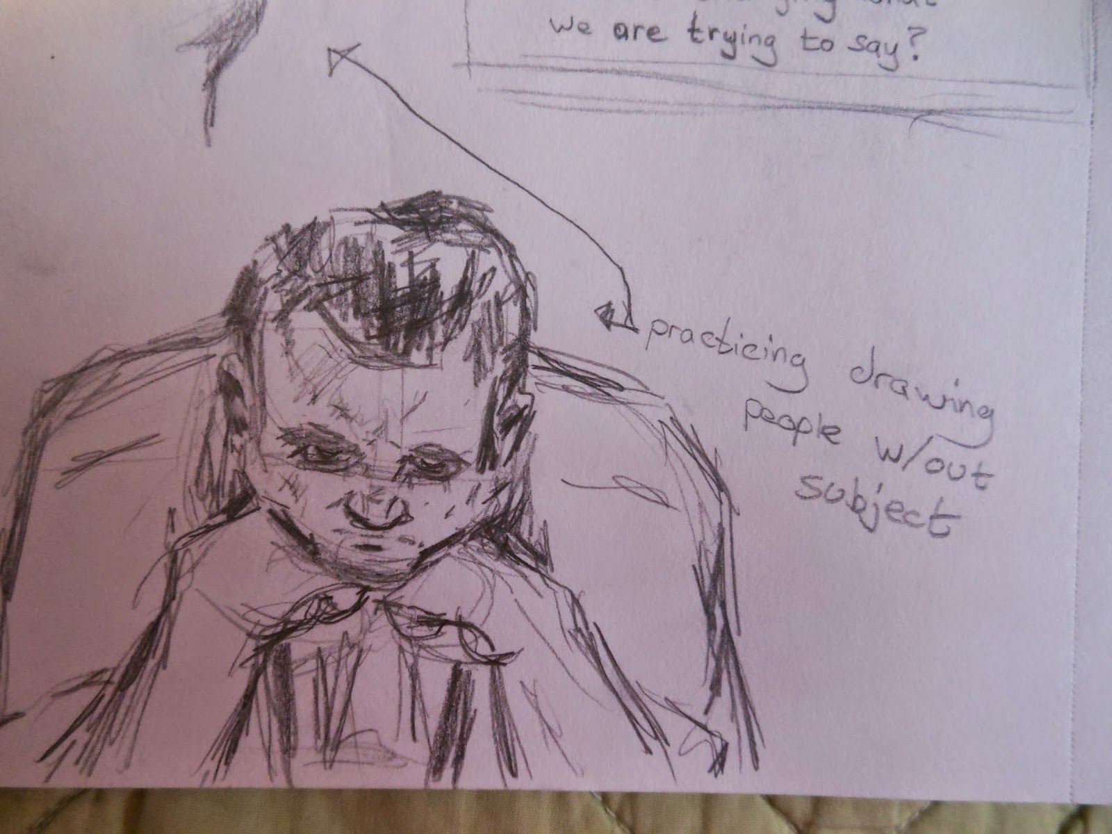
By the way for all of you who are up and coming artist allow me to tell you something. Sketch don't have to be pretty or detailed all of the time. It's sometimes about practicing what you see to remember fully later when you have a project. Here's a book I would recommend(I rather like it at least) checking out if you want to draw from real life (if nudity bothers you sorry it's still has good practices different ways of drawing):


Sketching People: Life Drawing Basics


Monday, June 23, 2014


The Monday rant:

        So part of being a designer or rather a professional one isn't just about knowing the skills of knowing how to create a beautiful master piece and/or the principals of design but also knowing or learning some of the business sides. For example: time management. Okay so it's probably not that wise to say this since this is a public blog(and I am in the processes of job hunting in my period of life)... but here it goes: I'm a constant work in progress for time management. Hence this late midnight post. 

But for the rant of the day or rather, my opinion of the day: to be a successful designer/freelancer you do need a since of organization. Yes I do think you can be that messy paint everywhere artist but knowing how to manage and organize your  time  is valuable. There are many aspect that time plays in our life from the many projects that are (prioritized and) handled, to the constant communication that must be maintained (being an artist requires being social who knew lol), to our personal life we try to have. Learning how to organize and manage these different aspects is a constant valuable learning experience.  


Some sketches from last Thursday:


Thursday, June 19, 2014

Color

Talk of the day.


Color is one of those things that has always amazed me. There is so many elements to it: hue, saturation, tone, shade. Color can define a mood and help tell a story. Color has meaning and can change meaning from culture to culture. For example in our society/culture typically white is the color associated for weddings and black for funerals. In some Asian cultures red is used for weddings and white for funerals. Below is something I found off the internet that talks about the use of color in banding. You can find more at http://www.pinterest.com/reebi/color/


Also here's some more sketches of the yesterday:


Wednesday, June 18, 2014

Monday, June 16, 2014

Beginnings

Hi.

So... I am a recently college graduate(only a month out so far). Majored in Emerging Media with a focus of Graphic Design and Illustration. This blog represents a goal for myself. I'm out of college and I still want to continue to grow as an artist, maybe even break away from some of the stubbornness I have regards to this giant thing we call Graphic Design. But most of all this blog I hope will become my venue for creativity; weather it's the sketch of the day(or week), a post about a tutorial I found and tried out, an opinion/observation of something I found(website, logo, packaging, artwork, ect.).

This is my art blog of discovery.

Welcome to my domain. (Mwhahaha!!!! :p)


P.s.- Here's a sketch I did yesterday.